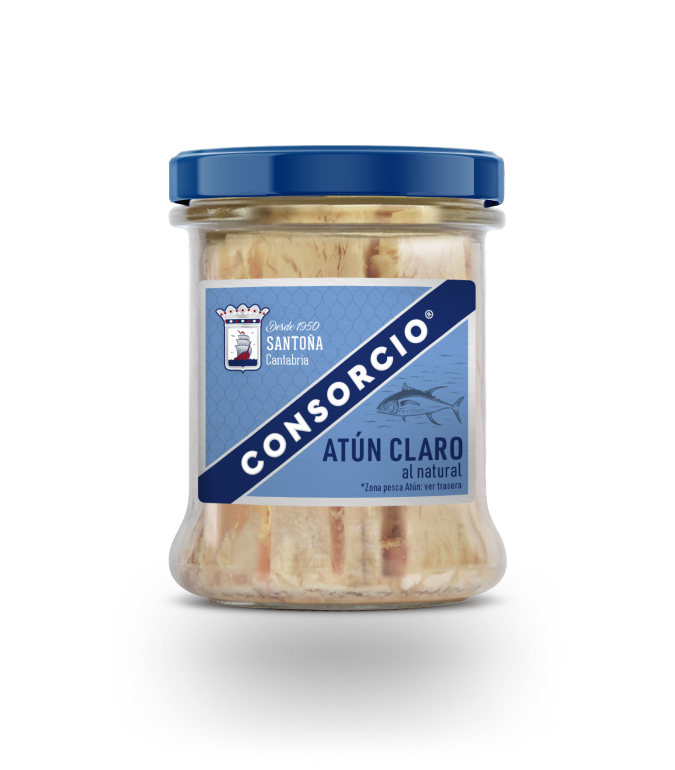
The challenge: to work on the restyling of one of the most iconic and well-known canned food brands in Spain.
A brand with a desire to evolve and with a clear approach from the beginning: to seek a graphic improvement in terms of continuity with the current image, improving various aspects of communication, in-store visibility and graphic style. A change that had to be strong but not revolutionary.


We decided to go for two of the brand’s most recognisable elements: the combination of blue and red, which have always been part of the brand’s identity. A light background weave adds a subtle and discreet touch of navy.
It represents the nets used to catch tuna, the unmistakable symbol of fishing boats.

The key to this is the brand’s contrasting blue, the unmistakable symbol of the sea, which envelops and uplifts the name.


We also decided to give more prominence to the Consorcio logo, reinventing the band and its position in all formats so that the whole helps to visualise the brand in a more powerful way. Clear and direct typographies complete a restyling that has had the objective of creating a more modern, organized and branded packaging.


